When it comes to visual branding, no element has more impact than color. Color touches people quickly and deeply in a way that words and shapes cannot.
That said, picking a striking color palette is just the first step. What’s more important is how those colors are applied to your marketing materials. In our recent color study of the law firms in the Vault 100, we found more than a few examples of websites that were visually underwhelming, despite the firm’s striking brand colors (including unusual shades of yellow, green, and purple).
So, who’s doing it well? Below we highlight a few of the best.
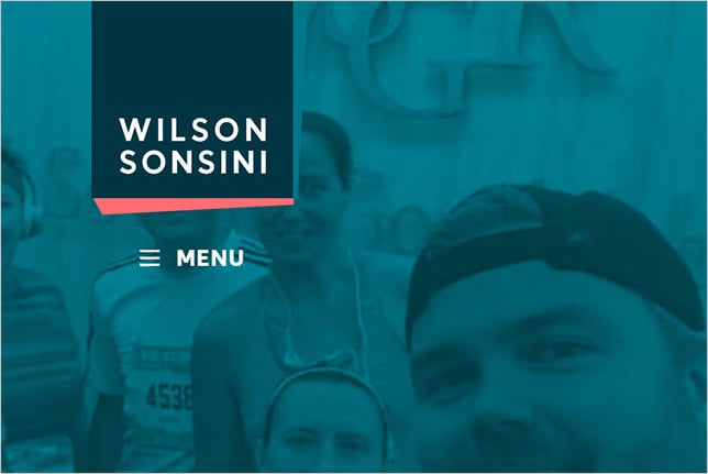
Wilson Sonsini
Wilson Sonsini makes a striking first impression with its use of teal and salmon. Some say that the firm’s recent graphic overhaul evokes the 1980s (and the TV show Miami Vice). I would call the firm a stylistic trendsetter for the 2020s. Visit Website.
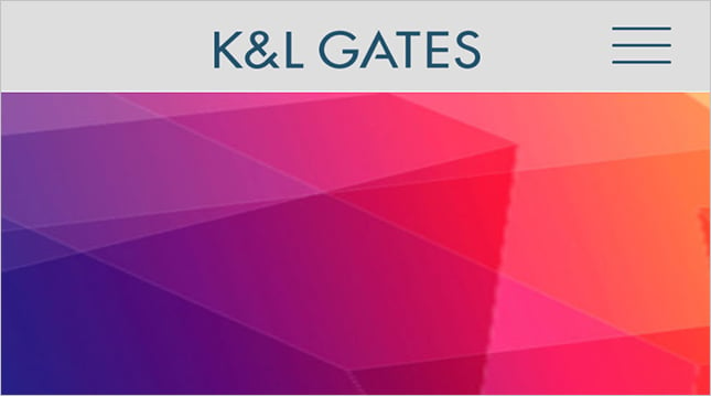
K&L Gates
K&L Gates didn’t settle for one or two colors, it chose the whole rainbow. Each section of the K&L Gates website is branded with a different color. And, surprisingly, it works beautifully. Visit Website.
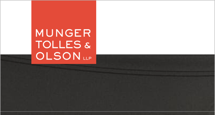
Munger Tolles
Munger Tolles proves that impactful color can be part of a sophisticated brand look. The firm's orange branding is beautifully juxtaposed against black-and-white imagery. This color combination allows the orange to pop off the page and make a bold statement. Visit Website.
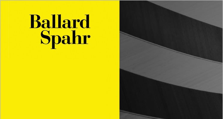
Ballard Spahr
No law firm owns a color the way that Ballard Spahr owns yellow. As the only large firm using yellow, they have embraced a striking visual identity that clearly distinguishes them from the competition. Visit Website.
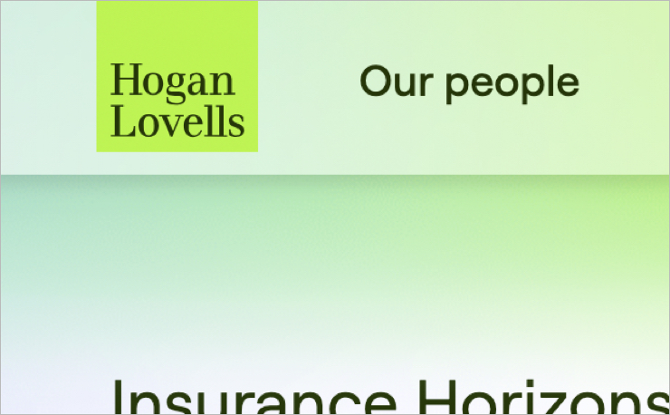
Hogan Lovells
Hogan Lovells separates itself from the pack with the bold (and generous) use of chartreuse. We can thank the Brits for that distinctive color, as Hogan & Hartson acquired it in 2010 when it merged with Lovells, a London-based firm. Visit Website.
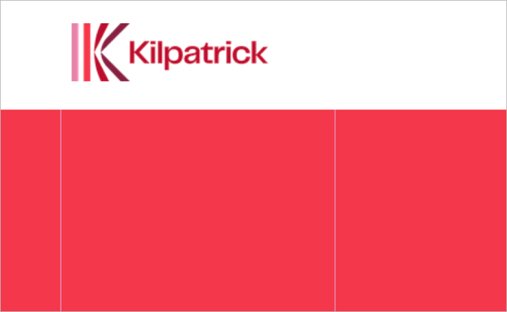
Kilpatrick
Kirkpatrick deserves kudos for its one-of-a-kind color palette featuring pink, red and burgundy. These colors, which are generally thought of as feminine, are a smart choice in today’s marketplace where a majority of law school grads are women. Visit Website.
Mintz Levin
I’m guessing that women played a strong hand in selecting the new Mintz Levin color scheme. The firm boldly rejected the “power colors” that middle-aged men traditionally favor and settled on a unique look that includes some pastels and sets the firm apart. Visit Website.

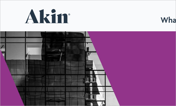
Akin
Akin isn’t tying itself to just one color. The new Akin website prominently features a variety of remarkable colors, including hot pink, electric blue, kelly green, and purple. None of these colors feel tired – and together they position the firm as a progressive force in the legal industry. Visit Website.
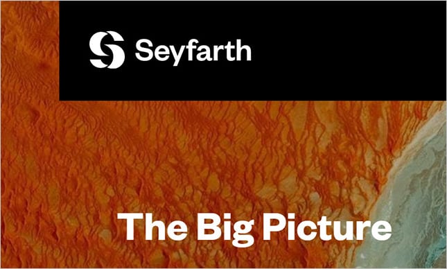
Seyfarth
Black and white might sound like a boring color scheme. However, Seyfarth pulls it off by contrasting its bold monochromatic branding with a selection of colorful header images. The firm also employs a beautiful palette of accent colors within its website. Visit Website.
Concluding Thoughts
Striking colors—and their creative application—can help businesses differentiate themselves in a sea of look-alike competitors. Marketers of consumer products have known this for ages. Law firms have only recently embraced the idea.
As competition in the legal industry increases (as is expected) and law firms become more marketing-savvy (as has been the trend), one can only imagine that firms will increasingly use color as a brand differentiator. Furthermore, I believe that the range of brand colors used by law firms will expand as a more diverse generation of lawyers moves into leadership roles. I look forward to updating this blog post (and this one) in a few years to examine this aesthetic evolution.
About the Authors
Robert Algeri is a co-founder of Great Jakes, a strategy-first brand and website design agency that partners exclusively with growth-focused law firms. He helps firms clarify their positioning and translate it into modern digital experiences that differentiate them from competitors. Deeply involved in the legal marketing community, Robert is an active member of the Legal Marketing Association (LMA) and has served on a range of boards and committees. He also writes and speaks regularly on law firm branding, websites, and growth, including contributions to industry outlets such as the LMA’s Strategies magazine.
Dion Algeri is a co-founder and Creative Director at Great Jakes. For more than 20 years, he has helped shape modern legal marketing by translating a deep understanding of the legal marketplace into sophisticated digital experiences for law firms. He writes and speaks frequently on legal marketing, including contributions to the American Bar Association’s Law Practice magazine. Dion also serves as editor of the Great Jakes blog, where he shares practical insights on law firm branding and websites.