In my last blog post, I examined how the logos of the Top 50 law firms had evolved over the past five years. I found that little had changed. Most of the logos were (still) relatively simple type-treatments that used muted colors and lacked flourish.
Was this characteristic of the entire legal industry?
I did not think so—but I wasn’t sure. So, I decided to examine the logos of 300 additional (smaller) law firms in the US. And what I found was a world of difference (compared to the 50 largest firms).
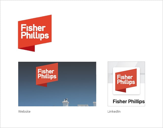
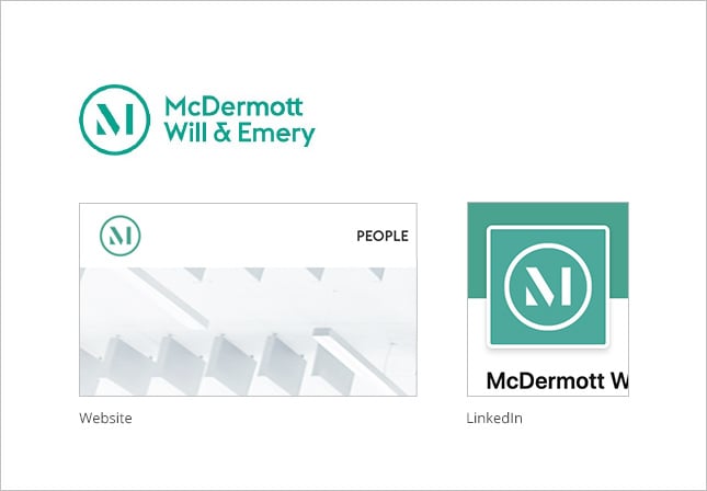
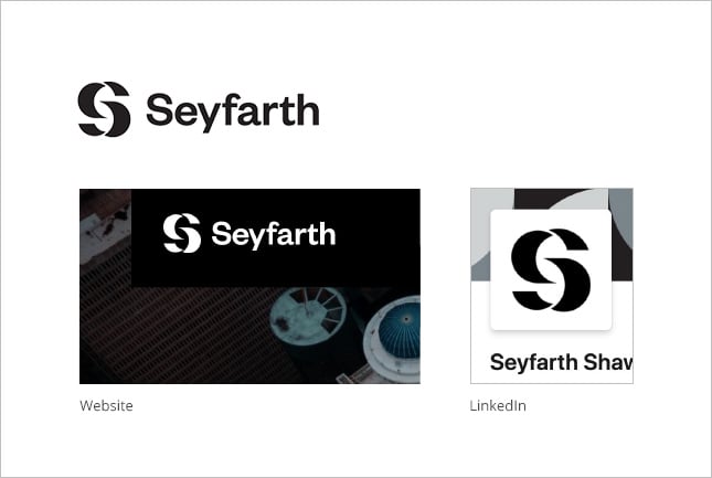
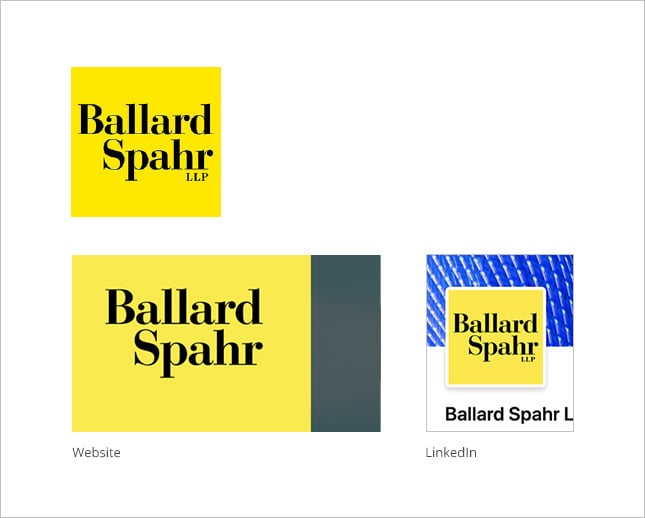
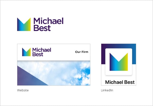
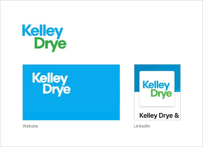
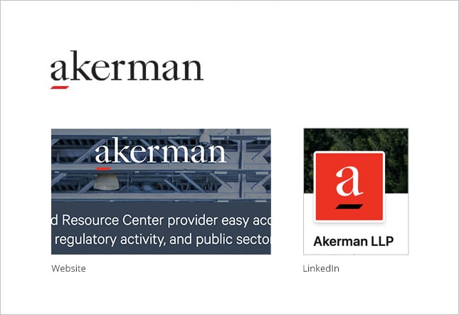
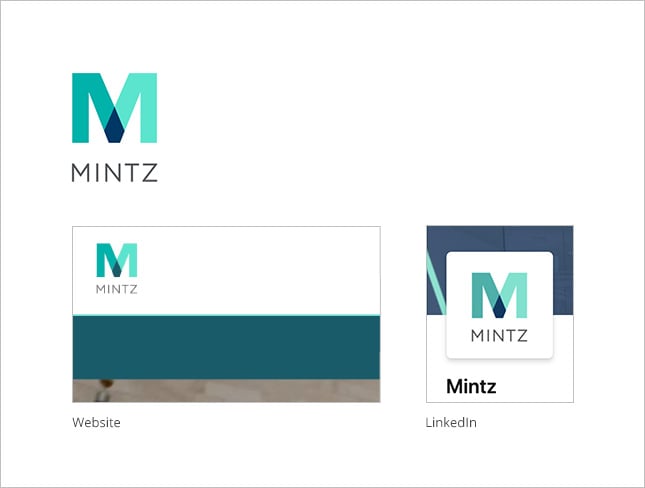
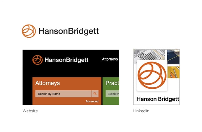
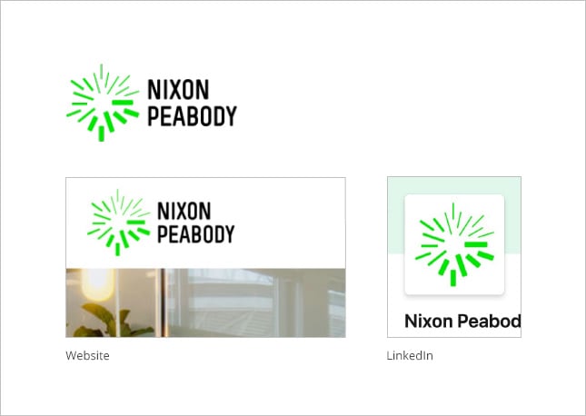
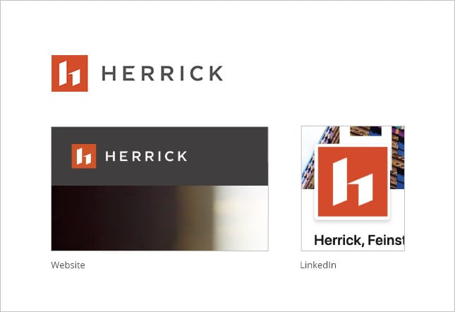
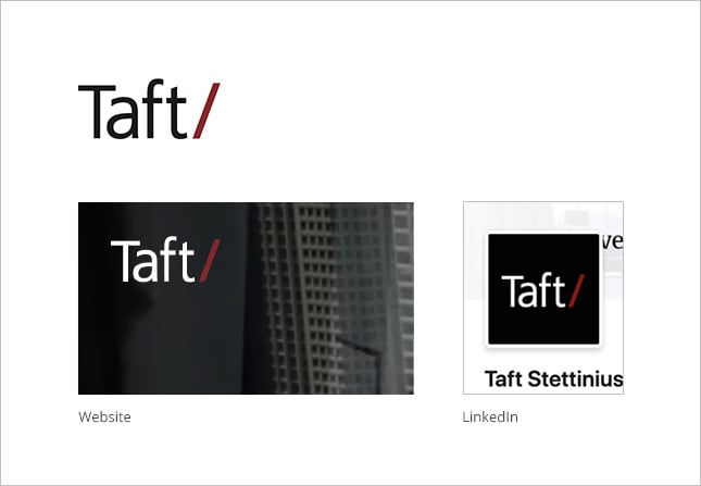
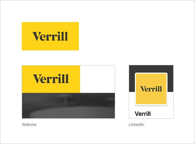
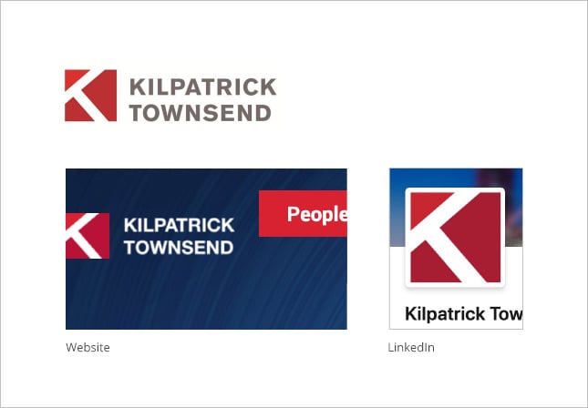
My research yielded plenty of examples of colorful, modern, and impactful logos. Additionally, I found that many of the logos were designed to be highly versatile (so that they would look good in any application or setting). This is especially important in the age of social media, as LinkedIn and Twitter require unique formats.
Below are 15 of my favorites. As a test of versatility, the examples below show how each logo appears in various applications (on white, on the firm’s website, and on LinkedIn).